material-ui-panel
Self managed PanelManager build in React.js with MaterialUI inspired from VSCode window system
📑 material-ui-panel
Alpha version (https://materal-ui-panel.herokuapp.com/)
Documentation: https://rand0mc0d3r.github.io/material-ui-panel/
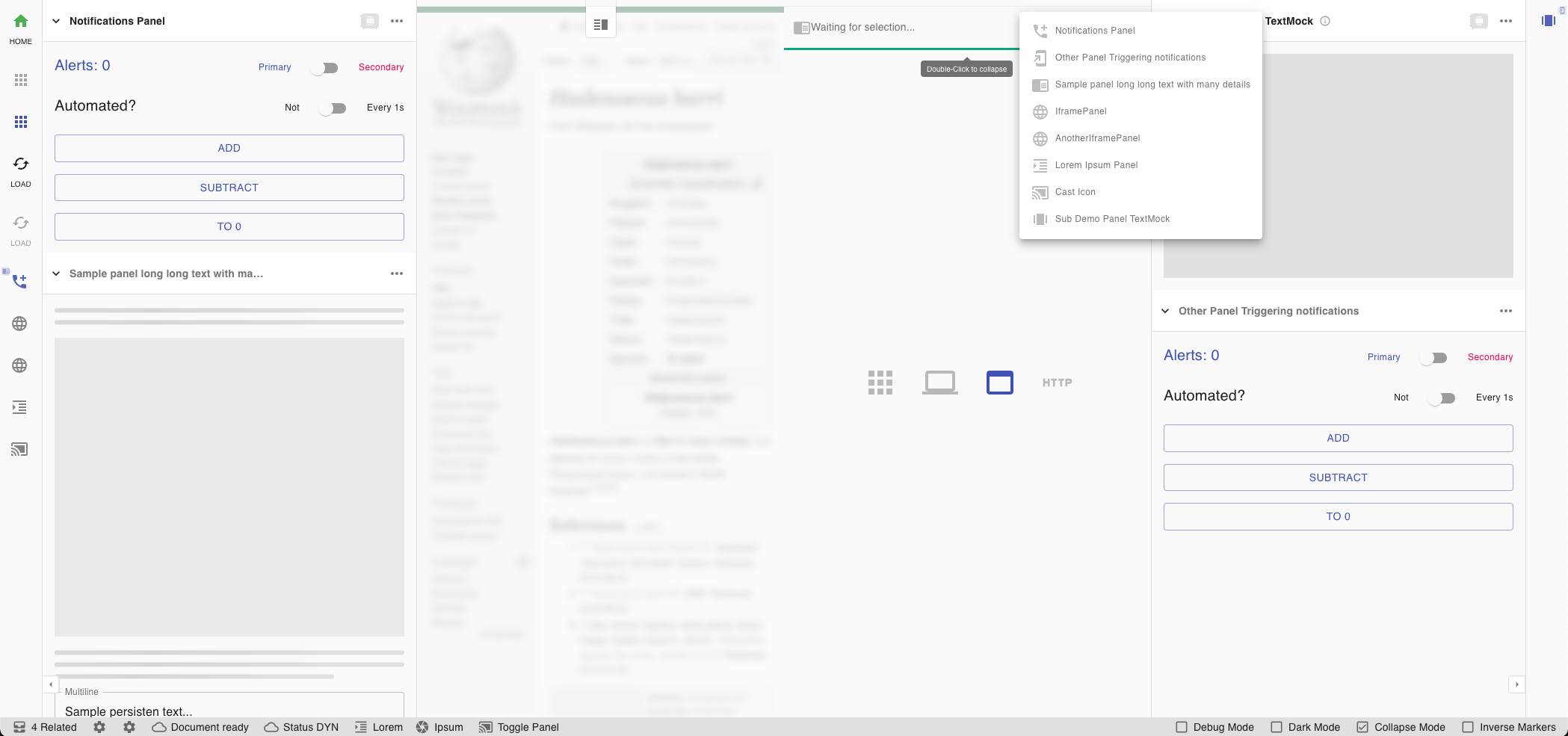 Hint: Combined panels ✅ , both sides panels ✅ , Splitted sections ✅ , Panel insertion into section ✅
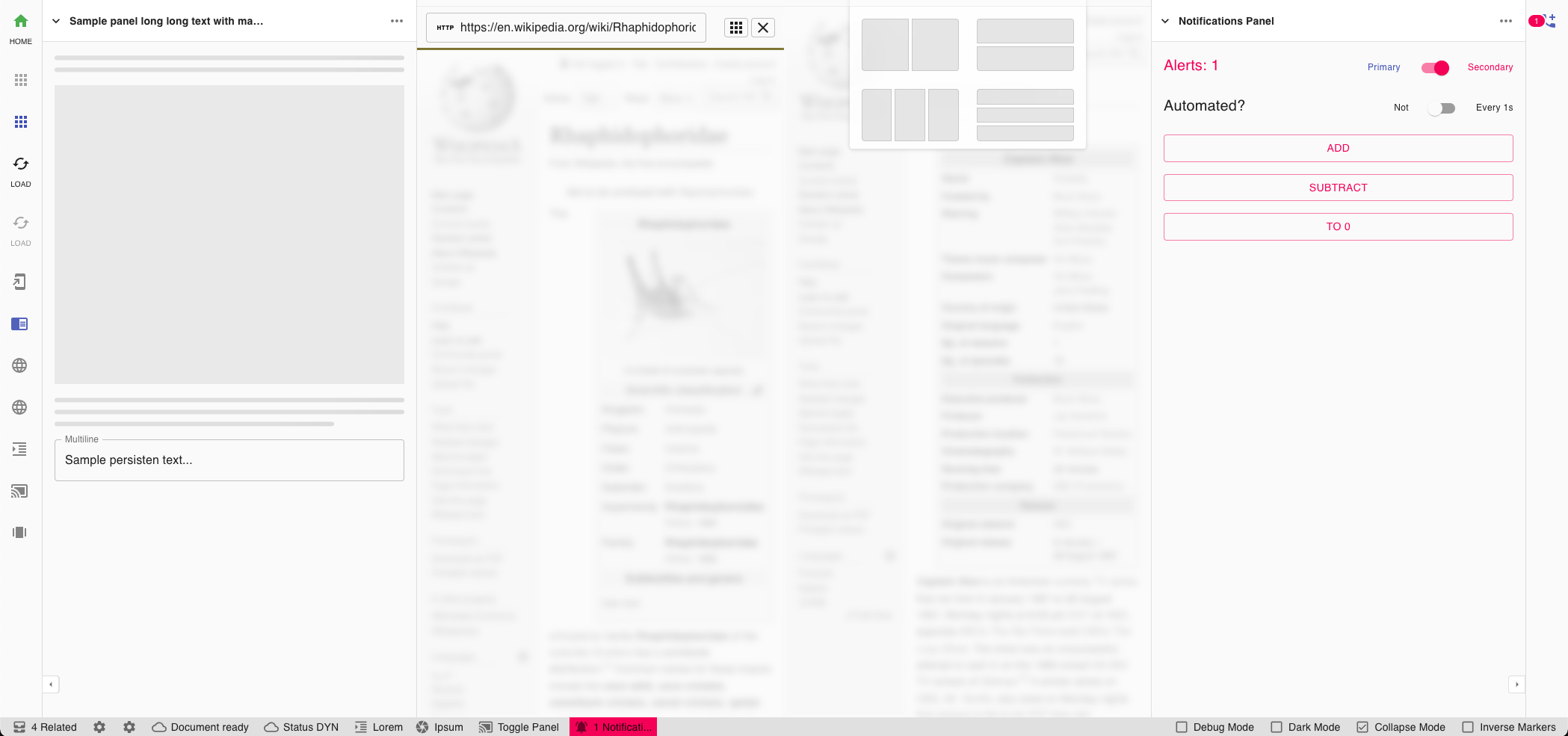 Hint: Alerts in status-bar ✅ , Alerts in sides panels ✅ , Splitted sections template selector ✅ , Embedded web-views ✅
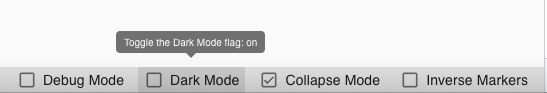
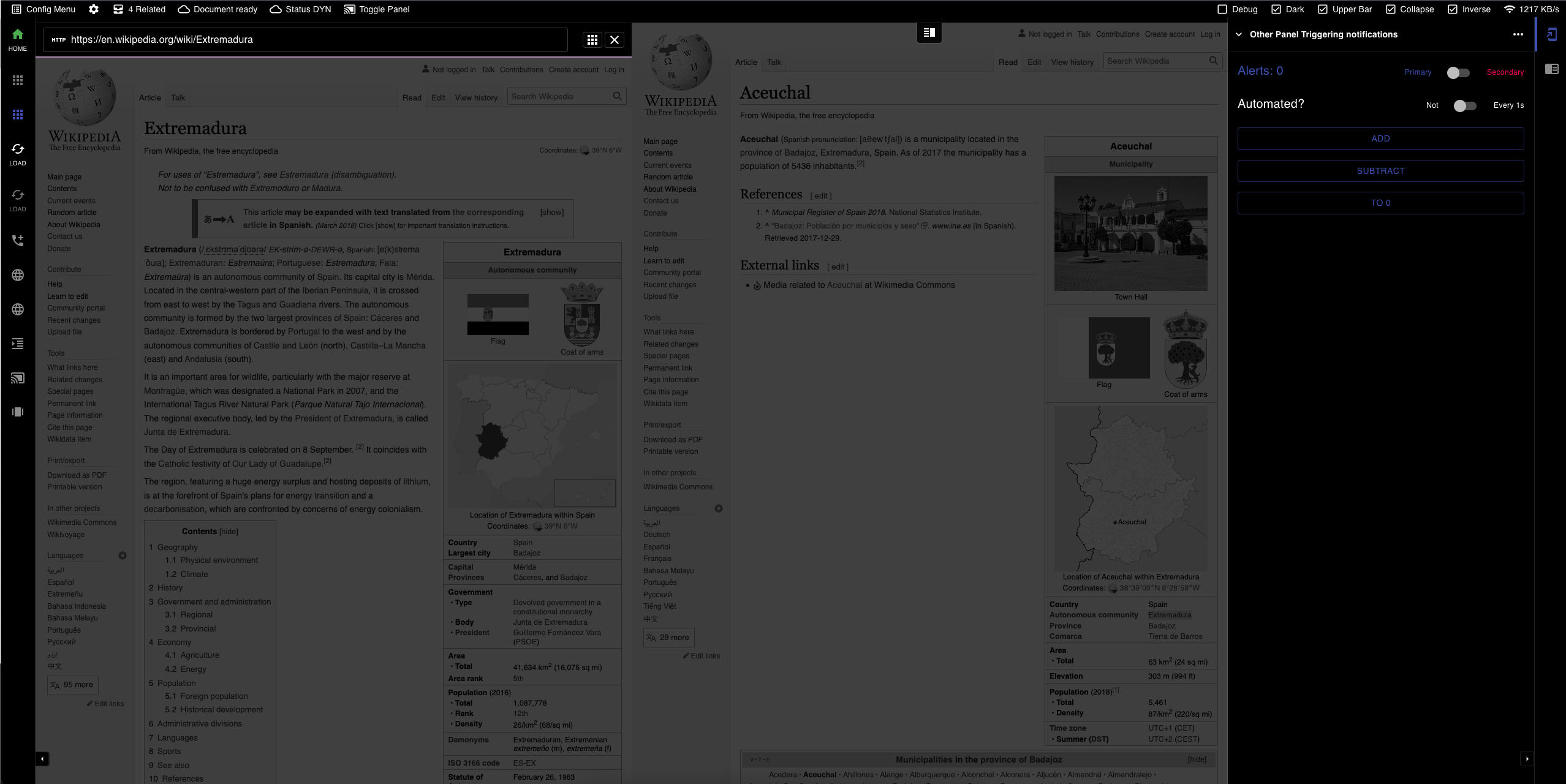 Hint: Dark-Mode ✅ , Upper bar ✅ , Menu capabilities ✅
A zero-maintenance/batteries-included panel manager inspired by VSCode style/aspect that adds via Material-UI elements a self populating/managed and state keeping organization of generated children panels.
Current limitations
- StatusBar
- Cannot display 2 status bars, 1 up and 1 down
- Status items cannot be ordered
- Status items are not draggable
- Status items don’t have a pre-defined size
- Status items require a unique id
NOTE: comes bundled with prop-types. No Typescript support. Help me by creating a PR 💌 .
🪄 Installation
Minimal version for mandatory dependencies. Up to the user to provide React 16.0+ and Material UI 4.0
Install the latest version with your favorite package manager.
npm install @kadarka/material-ui-panel --save
yarn i @kadarka/material-ui-panel
🎛️ Architecture & Structure
DOM & CSS Grid wise
The base structure it’s a grid with 5 columns, at most 5, at least 3 all the time visible, with 1 or 2 always potentially width: 0px
Grid-columns are [ ( 'leftMenu' '{leftPanel?}' ) 'main' ( '{rightPanel?}' 'rightMenu' ) ].
Side note: leftPanel and rightPanel are only visible if needed. Internally they are a grid-area sub-populated as a flex with direction column
Visually
| leftMenu | leftPanel | main | rightPanel | rightMenu |
|---|---|---|---|---|
announced panels for side: left |
panels[ ] qualifying for side and visibility properties | user main app | panels[ ] qualifying for side and visibility properties | announced panels for side: right |
📑 - < MuiPanelProvider >
The <MuiPanelProvider> is a HOC Context driven manager suggested to be added close the the root of the document, preferably outside the ±<Router> but inside the <MuiTheme>
The MuiPanelProvider constitutes of a wrapper around the Context API that acts as a store, with a few methods exposed to the user for managing the states, along with some internal methods that allow the panels to announce themselves, broadcast state changes and react to events. Communication is duplex and the panels themselves are in a dual-binding open chat with the Provider.
import { createTheme, ThemeOptions, ThemeProvider } from '@material-ui/core/styles'
// import { useMemo } from 'react'
// import { BrowserRouter as Router, Route, Switch } from 'react-router-dom'
// import routes from './routes'

export default (): JSX.Element => {
  const theme = useMemo(() => createTheme({ palette: { type: 'dark' } } as ThemeOptions), [])

  return <ThemeProvider {...{ theme }}>
	{/* ... */}
	<MuiPanelProvider>
	{/* notification?... */}
	{/* login/modals/errors?... */}
	{/* ... */}
	<Router>
	   {/* ... */}
	   <Switch>
	     {routes.map(({ path, exact, component }) => <Route key={path} {...{ exact, path, component }} />)}
	   </Switch>
	</Router>
	{/* ... */}
  </ThemeProvider>
}
Available tweaks’s
| Argument | Type | Default | Description |
|---|---|---|---|
| allowRightClick | boolean | false |
Determines if the panel allows opening the default browser context menu on right click |
| initialSide | string | left |
A side option to define for a new user the preference of the menu. Options left and right |
| inverseMarkers | boolean | false |
Determines is the highlight markers are oriented towards the outer borders of the screen, or towards the main content of the screen |
| markerColor | string | textPrimary |
Sets on of the material-UI Typography range of available colors. Options textPrimary, textSecondary, primary, secondary |
< MuiPanelManager >
Self organizing manager wrapper that renders all children given
Available API’s
| Argument | Default | Description |
|---|---|---|
| allowRightClick | false | Determines if the panel allows opening the default browser context menu on right click |
Code sample
<MuiPanelManager>
<MuiDivider tooltip="Default separator" />
<NotificationPanel />
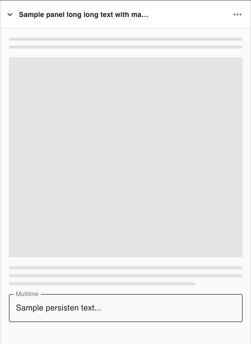
<MupPanel title="Lorem Ipsum Panel" icon={<FormatIndentIncreaseIcon />}>
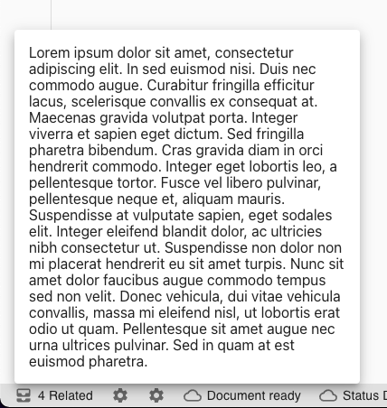
{`Lorem ipsum dolor sit amet, ...`}
</MupPanel>
<MupPanel title="Sample Panel" icon={<FormatAlignLeftIcon />}>
<Skeleton animation="wave" height={10} style= />
</MupPanel>
</MuiPanelManager>
< MuiPanelManager >
Self organizing manager wrapper that renders all children given
<MuiDebug> - 🕵️ (Internal) - Debug component
A utility modal to display the current state of the panels, layout, settings and the rest of the store. It’s constantly updated via the Provider hooks.
...
<MuiPanelProvider debugMode={true}...>
  ...
</MuiPanelProvider>
...
< Mui Splitter >
Self organizing manager wrapper that renders all children given
<MupPanel> - 🪟 Panel Component
The component creates a panel object to host the contents given. It’s self registered and managed
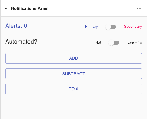 Hint: Panels can issue notifications
 Hint: Panels can feature automatic padding
<MupStatus> - 📟 Status Bar Component
The component creates an object for the status bar that can be clicked. It’s self registered and managed
Hint: Direct actions are permitted
Hint: As well placed menu actions
Hint: Informational sections
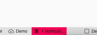
Hint: Errors are using the secondary color
Internally the wrapper <MupStatusBar> bound to the scene is not being rendered and started if there are no <MupStatus> announced across the application at any point in time. Later instantiation is fully encouraged to de-clutter the DOM.
Add a section to either primary or secondary side of the status bar. An omission will result in a default section.
Each MupStatus entity must contain an id in form of an unique identifier across the session.
# Inherited configuration
<MuiPanelProvider /> allows the user to configure the status bar with the following properties:
| Argument | Type | Default | Description |
|---|---|---|---|
| allowRightClick | bool |
inherited | Decides if right/long click triggers any action |
# Available arguments
| Argument | Type | Default | Description | |
|---|---|---|---|---|
| id | ⭐ | string |
… | Give a unique identifier to the status element |
| elements | ⭐ | array |
[] |
List of objects of type {icon: ReactNode, text: string} |
| side | string |
primary |
Determines to which side the panel is bound | |
| requestAttention | bool |
false |
When truthy is uses the secondary color |
|
| tooltip | string |
'' |
Provides a tooltip acting as a guide | |
| focusOnClick | string |
null | Toggles visibility of a panel known by <MuiPanelProvider> by it’s unique identifier |
|
| onClick | func |
() => {} |
Issues callback when status section is clicked | |
| onContextMenu | func |
() => {} |
Issues callback when status section is right/long clicked. |
Code sample
Simple example - static
// 2 icons with text
<MupStatus
  id="statusA"
  side="left"
  tooltip='33% frames left / Ready for photo'
  elements={[
    { icon: <FormatIndentIncrease color="action" />, text: 'Lorem' },
    { icon: <CameraIcon />, text: 'Ipsum' },
  ]}
/>

// 1 icon triggering a panel
<MupStatus
  id="triggerChromeCastPanel"
  side="left"
  focusOnClick='chromecastPanel'
  tooltip="Toggle visibility for panel"
  elements={[
  { icon: <CastConnectedIcon />, text: 'Toggle Panel' }
]}>
  demo text
</MupStatus>

// 1 icon doing an onClick callback
<MupStatus
  id='statusSimilarDocuments'
  onClick={handleClickOpen}
  tooltip="View Documents ... - (Last checked - 3 min ago)"
  elements={[{ icon: <AllInboxIcon />, text: '4 Related' }]}
/>

// 1 icon requesting attention, no text
<MupStatus
  id='statusSimilarDocuments'
  onClick={handleClickOpen}
  requestAttention
  tooltip="View Documents ... - (Last checked - 3 min ago)"
  elements={[{ icon: <AllInboxIcon /> }]}
/>
Dynamic example - updateable
  ...
  const [open, setOpen] = useState(false);
  const [elements, setElements] = useState();
  const [requestAttention, setRequestAttention] = useState(true);			// Request attention state

  const someFunction = () => {
   setElements([{ icon: <CloudDoneOutlinedIcon />, text: 'Document saved' }])		// Set an element
   setRequestAttention(true)								// Update attention state
  }

  ...

  return <>
    <MupStatus
      id='statusCustomElement'
      requestAttention={requestAttention}						// Reference attention state
      onClick={() => setOpen(true)}
      tooltip="Save Document?"
      elements={elements}								// Initialize empty (won't show)
    />
<MupButton> - 🛎️ Button Component
The component creates an 🏝️ ( + 📄 ) object that can be clicked. It’s self registered and managed
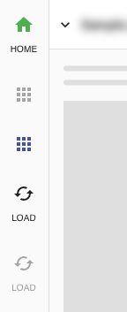 HINT: Works great to display a logo or a button with a custom icon ( + text )
Allows the developer to add to the sidebars a logo, a logo with a custom short text, or a button triggering a custom action.
Internally the <MuiPanelProvider> is made aware of the <MupButton> instance after the first render which triggers the internal hook to upstream call the provider with a new entity.
# Available arguments
| Argument | Req | Observed | Type | Default | Description |
|---|---|---|---|---|---|
| id | ⭐ | string |
… | Give a unique identifier to the status element | |
| icon | ⭐ | 👀 | node |
Passthru element of Node type. Uses cloneElement internally |
|
| tooltip | 👀 | string |
Provides a tooltip acting as a guide | ||
| shortText | 👀 | string |
Provides a short text of max 4 UTF8 chars | ||
| showIcon | 👀 | bool |
true |
Used to determine if the icon should be shown in case provided | |
| disabled | 👀 | bool |
false |
Determine if the colors turn gray and interactivity is disabled | |
| onClick | func |
Issues callback when status section is clicked |
Code sample
Simple example - static
<MupButton
  id="appLogo"
  tooltip={`Click here to go ${page.url}`
  shortText="LKDN"                                                  // 4 letters will be displayed in all CAPS
  icon={<BathtubIcon style=                    // custom color
  icon={<LinkedInIcon style= />}             // custom color
  icon={<SvgIcon component={StarIcon} viewBox="0 0 ..." />}         // raw svg icon
  icon={<Icon style=>add_circle</Icon>}      // font material icon
  icon={<Icon className="fa fa-plus-circle" color="secondary" />}   // font awesome icon
  showIcon={false}                                                  // hide icon
  disabled={true}                                                   // disable interaction
  onClick={() => console.log('clicked')}                            // callback
/>
Dynamic example - updateable
  export default ({ tooltip, shortText, icon, showIcon, disabled, ... }) => {

  return <>
    <MupButton
      { ... { tooltip, shortText, icon, showIcon, disabled } }
      id="appLogo"
      ...
    />
  </>
<MupContent> - ⚠️ Your Content Component -
This is the observable wrapper of your entire application. This should be included as close to root as possible where content represents your view or a representation of your current application UI.
Available arguments
| Argument | Type | Default | Description | |
|---|---|---|---|---|
| ⭐ | children | Node |
… | Passthru Node for the current app UI. Expecting the router output or the main <…> of the application. Consider to include all custom wrappers for <Layout …>, <Notifications …> and others. |
Code sample
Simple example - static
 <MupContent>
  <...>
    <ReactRouter ... />                    // your app page/pages
  </...>
 </MupContent>
TODO
- todo: make callbacks clean right the GC